FOUR KEY CREATIVE & WEB DEVELOPMENT TRENDS
“To be successful we must live from our imaginations, not from our memories.”
For more than 30 years, McCormick Taylor has provided creative and web development services to express our clients’ big ideas and support their most important projects and initiatives. Our in-house team provides a range of services including web and application development, photography and video production, graphic design, branding, communications, and 3D rendering and visualization. Below are four tools and trends on the rise that our team and clients have embraced. For more information about these topics and our creative and web development capabilities, connect with Justin Brugler.
01. Virtual Public Involvement Web Applications
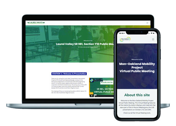
Long before Virtual Public Involvement (VPI) became a pandemic-era necessity, we embraced the model as a supplement to or replacement of in-person public engagement going back a decade. When delivered effectively, VPI can extend the range of traditional outreach efforts and increase inclusion for diverse audiences by removing barriers like time and distance. VPI is open for engagement 24/7 and available wherever people live. Whether virtual, traditional, or both, we believe an emphasis on quality content and inclusive strategy is how you ensure meaningful, accessible, and equitable engagement in any form.
Our VPI Platform is a flexible, user-friendly, and highly accessible tool that can be utilized either as a stand-alone web application or an extension to an existing website that adds VPI functionality. Navigating a virtual meeting room can present a challenge for a first-time virtual meeting attendee, but our platform can replicate the familiar station format of in-person meetings. By design, the ability to navigate, provide comments, and connect with a representative within our platform is intuitive for audiences of various ages and abilities. In addition, our platform uses an integrated database to easily collect and collate comments and report out across multiple file types. A responsive, client-branded interface provides a positive user experience across mobile devices, desktops, and screen readers.
Our Experiences
“We’ve used the new VPI Platform for several different clients in the southwestern Pennsylvania region. Each time, our clients are encouraged by the increased number of participants, returned comment forms, and analytics we gather, which, ultimately increases the feedback we receive and broadens the demographic of participants.”
Carrie Machuga, AICP – Planner I, McCormick Taylor








02. Accessibility
With the emphasis and reliance on online engagement and information sharing, content accessibility has become an even higher priority than it was previously. Yet, many sites and online communication tools are developed with barriers that make them difficult or impossible to access for the 59.6% of disabled people living in the U.S. with internet access (Statista).
Accessibility is defined as ensuring a digital product, such as a website, is as usable as possible by everyone, including people with disabilities. If you are a public organization or a private one that has government contacts/funding, you are required by law that all content meet a minimum level of 'AA' of Web Content Accessibility Guidelines (WCAG) standards. There are two overall approaches to evaluating your website’s accessibility: automated accessibility audits or manual accessibility audits. We’ve found a hybrid accessibility audit is the best of both worlds. Using a mix of manual and automated auditing techniques, you can tailor it to suit your organization’s capacity and needs, while filling in the gaps where each auditing method on their own fall short.
With the emphasis on accessibility, we’ve helped our clients make common online documents more compatible. By default, screen-readers only read the text in your document, and they read in the order defined by tags in the PDF. Making accessible documents ensures people with disabilities using screen readers, speech to text technology or braille displayers can navigate through documents. These requirements allow the audience to utilize document properties for contact information and document styles to jump from one part of a document to another, hear descriptions from picture and image tags to help understand the images on the pages, and have equal access to information that most of us take for granted.
Our Experiences
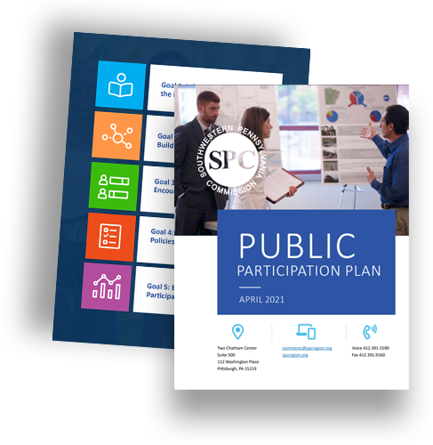
When it came to designing the Southwestern Pennsylvania Commission’s (SPC’s) Public Participation Plan (PPP), accessibility was at the forefront of their requests. We created the document by evaluating the content, graphics, and colors. The next step was to prepare the document using different document features such as but not limited to paragraph styles, creating tags for graphics and images, checking color contrasts, simplifying charts/tables, and lastly exporting for accessibility so all will transfer to the PDF. The final PPP document was created making sure the PDF reflects their inclusive culture and was accessible to everyone.
“I just want to say again how pleased we all are with the work you’ve done on this update!”
-Shannon O’Connell, Director, Office of Communications & Public Engagement, SPC
03. Video for Social Media
By 2022, the number of videos crossing the internet per second will approach 1 million translating into 82 percent of all online traffic. (Social Media Week)
The statistics are undeniable. People are drawn to videos on their social media platforms and are looking for more. This isn’t just a thing for TikTok or Instagram users, video has become more popular across all channels. Because of the popularity, clients are seeing the use of video translating into more engagement and exposure for their campaigns/projects. It also helps them tap into audience demographics not easily reached for them – millennials and Gen Z, while still capturing their base.
What makes a good social media video? Many of the traditional elements of any good video are still important to make social media videos, including good audience analysis, creativity, content, audio, lighting, accessibility, and overall appeal. But there are some differences that are game-changers.
- Videos should be short and sweet if possible. While videos do attract more attention, if it is too long you may lose your audience. There are exceptions to this rule. If longer is necessary, make it worth it to your viewers.
- Make an impact early in your video. It is more important than ever to grab the viewer's attention in the first few seconds before they can swipe to the next one.
- Quality isn’t always more on social media. Users are more interested in a genuine – real video than high-cost, high-production video.
- Adjust to your channel. Every platform is different and optimizing your videos for each will make a big difference. And don’t forget about mobile!
Our Experiences
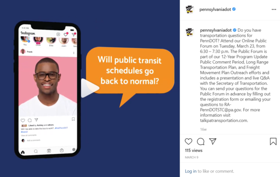
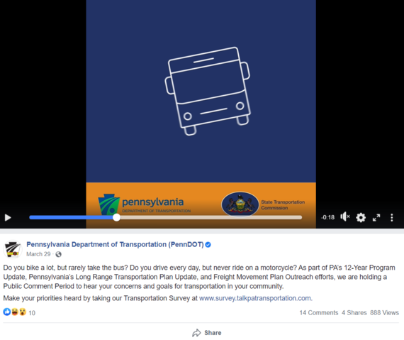
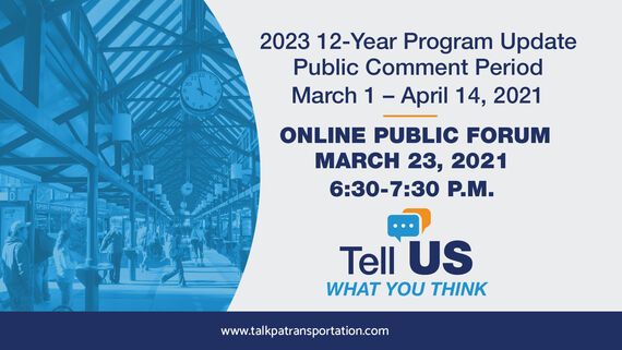
McCormick Taylor’s team has experience developing a variety of different types of videos for marketing and project-related purposes. For example, we collaborated to produce multiple videos for the Pennsylvania State Transportation Commission (STC) to promote an online public meeting and survey to collect public input on the 2023 Twelve Year Program (TYP). The team developed the storyboard, script, and graphics to produce the videos. They were produced in three languages including English, Spanish, and Mandarin. The videos posted to their social media channels helped to generate more than 1,905 live attendees for the 2023 TYP Program Update online Public Meeting (assuming one person per streaming device) and over 7,423 citizens responded to the survey. The survey was representative of Pennsylvania’s diverse communities with participation from every Metropolitan and Rural Planning Organization in the state.




04. Motion Graphics and Animation
The concept of giving movement to graphic design elements is not considered new technology, but trends do exist in the domain of motion graphics and animation. One such trend that we’ve experienced is that of animated logos.
Animated logos can take brand awareness to new heights. After all, an animated logo is going to grab your audiences’ attention far more easily than a static logo. They are being used more and more because of their ability to amuse, motivate, and intrigue audiences to take that next step and learn more about a project, product, or organization. Depending on the level of desired detail, the animation can be used to simply entertain, or it could be used to tell a story or allow audiences to make an emotional connection. Take a look at these inventive examples as provided by Adobe Creative Cloud.
Our Experiences
McCormick Taylor recently created animated logos for the Southeastern Pennsylvania Transportation Authority (SEPTA) and the New Jersey Department of Transportation (NJDOT) Local Aid Resource Center. Both logos were created using Adobe After Effects and Illustrator. For SEPTA, our team developed a new logo and branding package for their King of Prussia (KOP) Rail Project, which focused on connectivity and ease-of-movement. The animation was added (as part of a unified branding initiative across SEPTA’s breadth of services. The SEPTA animated logo is used on websites and in social media video productions.
The animated logo for NJDOT’s Local Aid Resource Center was designed to be part of the branding materials for all video production materials and at conferences. The animation helped to bring attention to the various functions the Resource Center provides by showing each representative icon move individually. Additionally, the direction of the graphic movements was utilized to pull audiences further into the logo and related information. This logo was animated in color and in black and white.
Additionally, we’ve used animation to enhance maps, presentations, websites, videos, and more.
